Thursday, December 25, 2008

Noise Reduction in Elements

Let's discuss the two most likely sources of noise we are likely to encounter.

HIGH ISO NOISE

When we went and set the ISO to 3200, we knew we were in trouble. We went there because we had no choice. Given the poor light, we couldn't possibly hope to get a high enough shutter speed or a small enough aperture to freeze the action, compensate for the telephoto shake, get all parts of the room in focus etc etc. We knew that we were going to have to accept some compromises with noise in order to get the shot but there was something ABOUT the pic which was more important than the potential noise problem. If we went to the trouble of hiking up the ISO, we will probably feel that the image is important enough for some heroic efforts towards optimisation.

UNDEREXPOSURE

Even at civilised ISO settings, we can still get into noise trouble. Often we find ourselves having underexposed a relatively important image on a paying shoot which then has to have substantial mid-tone boosting - a perfect recipe for noise. If I have bracketted or gotten other, better exposed versions of the same subject I'll discard the pic in question but sometimes Sod's Law applies and it's all I've got. I then have to try to do something acceptable with it.

In either situation, we are going to have to accept that the noisy image will never be the impeccably smooth and colour precise object of beauty it MAY have been at low ISO settings and/or if we'd have exposed the thing correctly. What then are we to do?

  • We can accept the noise as it is.
  • We can make the noise seem more acceptable.
  • We can try to reduce the noise.
  • We can try to eliminate the noise
There are times when the actual picture and a reasonable degree of detail will be all important in which case we may need to leave the noise alone. There are times when the subject of the picture is very important but small detail is not the essence, in which case we can risk smearing small detail so long as the principle features of the image remain clear and defined. There are times when some form of film grain style noise might prove more acceptable or actually assist the image. Here we might remove colour noise and/or reduce colour saturation - perhaps render the image in greyscale. Sometimes we can compromise, particulary for smallish prints - remove SOME noise but accept the fact that some must be allowed to remain. There are times when smoothness and softness is the most appropriate look and loss of fine detail can be "lived with". In this case we can go further with noise reduction. Each of us must decide, in the case of every new noisy image, which is the best approach.

Certainly our decision making will be influenced by the ultimate display application. If the image will finish up as a small print or a relatively small image on a website, we enjoy a little more latitude than if it is to be published in the print media or blown up for framing. Likewise, depending on its subject value, a news pic will sometimes be acceptable in grainy greyscale but a commercial image in a display ad must be as technically perfect as possible.

Let's get one thing straight. With very few exceptions, noisy, high ISO images will RARELY be converted to clean, sharp, high detail images with one, simple, carefree pass of the NR software. It never really works that way. When we set out to remove noise artifacts, inevitably some details and texture will be interpretted as noise and get removed as part of the deal. In the final analysis, we WILL have to accept one or other of the above compromises ..... albeit, only after a good fight. For the purpose of THIS exercise let us decide to reduce noise to roughly acceptable levels - suitable for small prints and medium sized website illustrations

Until recently running "Noise Ninja" or "Neat Image" as a plug-in was the way to go. In recent times Photoshop and Elements have had the benefit of a serviceable noise reduction facility of their own in the form of Filter - Noise - Reduce Noise. Neat Image & co. are more powerful but with the judicious use of Layers and multiple passes on selected areas it can do pretty well.

Here is an approach upon which you may like to base your own experiments:

  1. Go to Layers menu and click on Duplicate Layer
  2. Go to Filter - Noise - Reduce Noise. Strength 10, Preserve Details 20% and Reduce Colour Noise 70% Click OK
  3. Choose shadow areas and expanses of featureless open space (e.g. sky & walls) which continue to show noise, select them roughly with the Quick Selection tool. Re-run Reduce Noise on the selected areas with the previous settings.
  4. Tour the image, viewing it at 1:1 (100%) and using the "Blur Tool", tidy up any last remaining spots of noticeable noise or processing artifacts
  5. Run the Unsharp Mask. Amount 200, Radius 1, Threshold 10
  6. Using the Opacity slider, fine tune the blending of the treated and untreated layers
  7. Save as a .psd file. Flatten image and save as a jpeg.

See my work at http://www.pbase.com/davidhobbs
Wednesday, December 24, 2008

Sharpening Alternatives in Elements

It is my firm belief that the Unsharp Mask remains the most satisfactory approach to sharpening in the Adobe Photoshop Elements. The tool in Elements is virtually identical to the one in CS4. There are masses of references, advice sites, tutorials, opinions etc based on this one tool. If used in combination with Layers and or tools like the great new "Quick Selection" tool you can exercise great control over the process and selectively sharpen parts of an image, which is especially useful in the event of small focussing errors.

The "Sharpen" tool (which resides with the icons down the extreme left of the screen) is more correctly a brush and can sharpen small areas of detail if required. On occasions it can be worhwhile but is hard to use well and requires much practice to do so. Close examination often reveals lots of sharpening artifacts where it is used

The last sharpening facility I shall deal with is the "Adjust Sharpness" tool which sits immediately below the Unsharp Mask on the Enhance drop down menu. This tool is based on the excellent "Smart Sharpen" tool in CS3 and CS4. It was seriously intended to supplant the Unsharp Mask by approaching the compromise between sharpness and noise from a different direction. It retains the Amount and Radius settings for sharpness control but omits the important Threshold slider which serves to minimise increasing noise while sharpening.

Most noise is evident in shadow areas and so in the Smart Sharpen tool a flexible facility is provided for fading the effects of sharpening in noise prone areas. Very clever. It also incorporates a means of minimising motion blur with an "angle" dial. Theoretically it can tidy up some pictures made blurry or soft by slight camera movement in a way previously denied us.

All of this is very flexible, very powerful and calculated to improve an image's perceived sharpness with a minimum of damage to fine detail.

Unfortunately, when transferring Smart Sharpen to Elements in the form of the Adjust Sharpness tool, the designers (for some reason which leaves me astounded) removed the powerful "Shadows" and "Highlights" tabs which facilitate sharpening without highlighting noise. Consequently, for most images, most of the time, Adjust Sharpness in Elements is effectively the Unsharp Mask with the Threshold setting taken away. What (may I humbly ask) was the point of that? Words fail me. Of course the motion blur removal device is still present but I have yet to be entirely convinced of its benefit in practice.

Well that's all for now. Next time I shall look at Noise Reduction in Elements ... oh and Merry Christmas!

Sunday, December 21, 2008

Sharpening in Elements part 3

The big problem with the Unsharp Mask is that while you DO get visual feedback about your sharpening parameter settings at the time of using it, you eventually have to commit yourself by hitting the OK button. Later, having stared at the image some more, you might easily conclude that you've overdone it, not gone far enough or got the balance of parameter values wrong for your display application. If you've saved the sharpened image you then have to revert to your sooc version (hopefully you DID rename the edited file) to begin the various edit steps again. If you haven't saved the sharpened image then you must go to the Undo History window, revert to the step before Unsharp Mask and re-do it. Then eventually you may change your mind again. Surely there's a better way - a way to fine tune your work as you go.

Here is a workflow approach to sharpening jpeg image files (and we ARE talking about jpegs) which largely solves the fine-tune problems and save a lot of time (and hassle) in the long run.

Ahem! The Hobbs Method:

Open your sooc image, determine that it is worth editing.

  1. Save it as a new filename, perform exposure, colour, cropping and any repair edits
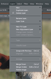
  2. Go to the "Layer" menu at the top of the screen and click on "Duplicate Layer"
  3. Perform a strong general sharpen (say) Amount 300; Radius 1.8; Threshold 3 OK
  4. Go to the Palette Bin Layer window and click the little down arrowhead next to "Opacity". A slider appears which monitors and fine tunes your sharpen from 100% back to zero
  5. When you are satisfied with the result, save it as a default .psd file
  6. Go back to the Layer menu and click "Flatten Image"
  7. Save the file as a jpeg.
There! That wasn't so hard was it? But what did we accomplish with all of that?

For a start we preserved the original sooc file - just in case. Secondly we saved an edited .psd file. Thirdly, we saved a completely finished, ready-to-use jpeg. Let us suppose that, later on, we decide that we got the sharpening wrong for our purpose in the jpeg and that we need to fix it. We COULD go to the sooc file but that means we have to redo all of the other edits, which (depending on the file) could take ages. Instead we go to the .psd file. Here we find that the duplicate layer is still in place, which allows us - using the opacity slider to quickly change the fine tune before saving a new jpeg. At worst we delete the original duplicate layer, do an entirely new sharpen run and fine tune again.

This is the best way I know to time efficiently edit a jpeg file while being able to quickly amend sharpening as needed for any purpose. At the same time we have been able to fine tune our sharpening in a way not normally offered by the Unsharp Mask.

There may be some who are not certain what actually happened in the Layers jiggery pokery. When we created the Duplicate Layer, our subsequent sharpen was performed on that layer alone, leaving the original "Background" layer completely untouched. When the Opacity is set to 100%, all we can see is the sharpened image on top. As we progressively move the slider back toward zero, more and more of the sharpened overlay is progressively made transparent, until at 0%, it is completely erased, revealing the original unsharpened image. We just move the slider back and forth between "completely sharpened" and "not sharpened at all" until we feel the compromise is finally right. Coool!

Next time we'll look at the "Adjust Sharpness" command.

See my work at: www.pbase.com/davidhobbs

Saturday, December 20, 2008

Sharpening in Elements part 2

Let's return to our Unsharp Mask dialogue box and to the matter of the parameter values. There are several considerations which, for me, influence the Unsharp Mask parameter values. They are:

  1. The overall condition of the image
  2. The amount of noise in the image
  3. The subject style of the image
  4. The final intended image display format

IMAGE CONDITION

If we are confronted by a genuinely POOR image, unless the content is important and unable to be re-shot, I am inclined to reject it altogether. Experience has taught me that, beyond a certain point, it will always be a matter of rubbish in - rubbish out.

On the other hand it seems clear that if a sooc (straight out of camera) image happens to be well nigh perfect (a somewhat rare event) SOME sharpening will always be a good idea, but not very much. When I say well nigh perfect I mean:

  • No discernable camera movement or out of focus softness
  • No readily discernable noise
  • No significant adjustment of exposure required
  • No white balance adjustment required
There is ample evidence that Amount values over 100 and Radius values over 1.0 can allow some sharpening halos to become visible under close examination. Sharpening halos (i.e. previously described highlight lines along edges) are always present, but in some parts of an image they will be more noticeable than others, particularly as halo lines become brighter and/or wider.

For a full sized near-perfect sooc image which will only ever be viewed on a computer screen and likely to be scrutinised by a pixel peeper, the best Unsharp Mask values could easily be as follows

Amount: 100
Radius: 0.5
Threshold: 0

IMAGE NOISE

If an image has been shot at high ISO values, it will probably show noise, especially in shadow areas. If the image is underexposed and has to be brightened, the noise will be enhanced in the process. If colour saturation and/or white balance has to be adjusted, chrominance (i.e. colour) noise will be further elevated. In sharpening the image, we have to avoid making the problem still worse.

If the noise is only really visible under pixel peeping and the final form of the image will be (say) a 6x4 inch print, noise reduction may do more harm than good. During sharpening we should set the Threshold value to about 5. When the Threshold is 0, virtually everything in an image will be regarded as large enough to have an "edge" around it and thus be deserving of a sharpening halo. Because of this, masses of tiny noise artifacts will effectively be enlarged and made more noticeable. As we increase the Threshold value, progressively larger objects (most especially the noise) are omitted from the sharpening process. Thus important features of the image receive sharpening while existing noise artifacts should be made no worse.

Unfortunately the subjective effect of increasing Threshold values is to reduce the overall impact of the sharpening process. Accordingly it becomes necessary to bump up the Amount and Radius values to retain the visual impact of having sharpened an image while avoiding noise enhancement. So for a somewhat noisy but otherwise acceptable image, Unsharp Mask parameters might well be:

Amount: 180
Radius: 0.9
Threshold: 5

IMAGE SUBJECT STYLE

Once again, let us assume that our sooc image is basically excellent but we still want to overcome its anti-aliasing filtering and incomplete camera sharpening. The parameter values may be influenced by the subject style of the image itself.

Let us first imagine a truly complex mega-edge image such as a garden with masses of shrubs and trees with many many thousands of leaves, petals, twigs, compost bits, pebbles, blades of grass etc etc. A lot of these features start to assume the size of the noise particles in our last example. If we set our Threshold value too low, the image is made more muzzy by the thousands of tiny halos. It becomes actually harder to identify objects in the image than it may have been before. Unless there are some features of the image that are less edge dense, there may be a sound argument for not sharpening at all. However it is usually true that some features of such an image - such as people or statues etc (which are indeed less edge dense) may indeed benefit from sharpening.

It may be best to retain a high Threshold value so as to leave the millions of leaves and gravel pieces in relative peace while still sharpening the people. A low Radius value might also be a good notion, while to compensate, one might consider a slightly higher Amount value.

Amount: 200
Radius: 0.5
Threshold: 5

Some image styles are inherently short of prominent edges and the edges which DO appear, might well be low contrast in nature. Such images might include close ups of faces with large expanses of fairly feautureless skin or close ups of flower heads in which the main features are delicate fibrous patterns in petals and large leaves.

In such cases we may WANT to highlight fine texture and may WANT to emphasise subtle edges. You may like to try parameter values such as:

Amount: 200
Radius: 1.5
Threshold: 1

INTENDED IMAGE DISPLAY FORMAT

Once upon a time, the vast majority of images captured by cameras were either intended for privately viewed prints or commercially published transparencies ... and that was basically that.

These days the situation has changed. Vast numbers of images may never reach paper. Most pictures taken for private/family consumption will never be published, never even be printed for display in frames and albums. Indeed most will never be anything other than digital images for display on computers, electronic display frames and/or television sets. Even then, many will stay full size while vast numbers will be resized down for use in emails or on web galleries.

Small prints, large prints, published prints, slideshow images, resized images. All of these intended uses embody different considerations when post processing. The issue often requiring the most thought will be sharpening. Indeed many photographers will not sharpen their processed images AT ALL until final intended display formats and applications have been determined. They will then sharpen particular versions for particular applications

Leaving aside the considerations already discussed, these are some VERY GENERAL suggested parameters for particular display applications:

Prints in general will benefit from extra sharpening as the process of printing will tend to rob many images of their sharpness, while noise seems generally less prominent in prints than it might be on a computer screen:

Amount: 200
Radius: 0.7
Threshold: 0

Images resized down for email or web gallery display will benefit from increased radius. Halos which might have been visible full size, may not be when everything has been proportionally reduced. Assuming you sharpen an image BEFORE scaling it down, the parameter values might be:

Amount: 200
Radius: 1.5
Threshhold: 3

And so on and so on. In the end, each of us has to make a decision based on many considerations. There will never be ONE correct set of values in every case. Experiment for yourself based on the suggested values. In the next article we'll examine an approach for more accurately customising our sharpening for individual images.

See my work at: www.pbase.com/davidhobbs

Friday, December 19, 2008

Sharpening in Elements

The vast majority of images which I edit, undergo four processes:

  1. Adjust Exposure/Contrast
  2. Adjust Colour Intensity/Temperature
  3. Adjust Composition (cropping)
  4. Adjust Sharpness

We have already dealt with the first two. Elements' excellent cropping tool is almost self explanatory but there are a few little points I'd like to discuss concerning it, another time. This article is about sharpening.

Virtually all camera sensors to date incorporate an anti-aliasing filter which is intended to lessen the potential effects of pixellation in digital images. One could understand its use in days of yore when resolution was always low but in this era of Nikon D3xs and Canon 5D mkIIs with 20 odd megapixels of resolution, one wonders why it is necessary to worry about anti-aliasing. Still, I suppose engineers (as opposed to marketing gurus) know best.

The point is that anti-aliasing filters deliberately blur images. If there was no sharpening of digital images at all, they wouldn't look very impressive. As it is, (unless you are shooting RAW files - and not always then) nearly all cameras perform SOME sharpening to images before you even see them. Let's be clear. Most "straight out of the camera" images have ALREADY been sharpened.

High pixel density point & shoot type cameras tend to sharpen images more than relatively low pixel density DSLRs. This is because it is assumed by the designers that p&s shooters won't want to be bothered with post processing at all and that the in-camera sharpening is the only sharpening that will ever happen. If you own a point & shoot/compact style camera I would strongly recommend that you go into your camera's menus and turn the in-camera sharpening effect down. Each make & model of camera will be different in this regard and it pays to experiment. The point is that if the original image is already a little oversharp, further sharpening in post processing will mostly serve to highlight whatever noise may exist in the image, create processing artifacts and produce prominent sharpening halos. Yuck!

Most often, while the sooc (straight out of camera) image may have received a slight degree of sharpening in-camera, it will still be a relatively soft picture, still requiring post process sharpening to look its best. Fortunately it is in the nature of post processing that adjustments like sharpening can be properly controlled and monitored - at least in theory.

We return to our cow from the end of the last article which you should open in Elements. Go to the Enhance drop down menu. In the first section of options there is an "Auto Sharpen" tool which often works quite well. I want you to ignore it however because of the fact that it affords you no manual control and no opportunity to learn about the process. It fails to take into account how an image will ultimately be used. It effectively behaves like the original, dumb, in-camera facility. Let's leave it.

In the third section of options there are two sharpening tools. They are "Unsharp Mask" and "Adjust Sharpness". As it happens, both are excellent.

Unsharp Mask is the venerable Photoshop tool with the odd name. Explanations regarding how this tool was developed and how it got its name may be found in various places on the web so I won't go into that here. Let's just look at the classic dialogue box and examine the three parameters:

  1. Amount
  2. Radius
  3. Threshold
Sharpening is performed by effectively increasing the contrast along edges. Edges are defined by one tone/colour being aligned with a DIFFERENT tone/colour. When an edge is selected for sharpening, the lighter tone/colour side of the edge is further lightened immediately next to the edge and fades gradually back to the original tone/colour as one moves away from the edge. Likewise the darker tone/colour side is further darkened along the actual edge and fades back as you move away.

Simplistically explained, the Amount describes the DEGREE of lightening or darkening which takes place during a sharpening operation. The Radius describes the WIDTH of the area on either side of the edge which is affected by lightening/darkening. The Threshold describes the SIZE of an image area which the software will recognise as an edge in the first place.

Just for the hell of it. Let us enter the following values for the Unsharp Mask dialogue box by moving the respective sliders:

Amount: 300
Radius: 1.2
Threshold 3


Click on OK and there is our cow all sharpened. In the next article we shall examine parameter values in some detail.

See my work at: www.pbase.com/davidhobbs

Thursday, December 18, 2008

Adjusting Colour in Elements


For the purposes of the exercise I am going to cheat a little here. We have returned to our picture of the cow but I have reduced the colour saturation and raised its colour temperature a fraction in order to demonstrate two of the nice colour adjustment tools in Elements.


Click on Enhance and then "Adjust Color" (Americans will never learn to spell - sigh!). We see eight options on a new drop down menu. "Remove Color Cast" is a little superfluous if we used the eyedroppers in Adjust Lighting during the last exercise. In any event it behaves very much as an "auto" command, taking fine control out of one's hand. "Remove Color" is a crude black & white conversion tool which doesn't work nearly as well as the earlier "Convert to Black and White" tool.

"Replace Color" is a potentially powerful tool to manipulate particular colours within the image while leaving others alone. It can be fun to use but I have never been motivated to use it during real life post processing. "Adjust Color for Skin Tone" is also a potentially powerful tool which in practice I never use much, given that when other aspects of an image's exposure and colour balance have been dealt with, the need for it mostly goes away. "Defringing Layer" might be useful but I have never seen an application for it, thus far.

"Color Variations" is a fun way to adjust colour temperature, remove color casts and generally tinker. It offers lots of genuine fine tuning but at the end of the day is a much slower way to go about things than its alternatives. "Adjust Color Curves" looks at first glance as if it might be powerful but compared to the "Curves" tool in Photoshop and indeed Elements' own Levels control it's a bit of a toy really. There's more to be said about Adjust Color Curves ... but take my advice and don't bother with it.


That leaves "Hue/Saturation" which potentially gives you almost complete control over everything to do with colour with the aid of calibrated sliders. In practice I'd recommend you concentrate mostly on "Saturation", for the most part limiting its manipulation between +/- 20. This facility also offers interesting coloration options for black and white images such as various types of sepia etc

Okay, lets bump up Saturation to +20 on our cow.

For some obscure reason the Elements' designers decided to hide a very useful tool in a very strange place. If you look at the top of the Palette Bin you see three edit tabs: "Full", "Quick" and "Guided". The vast majority of what we will do will be in the Full area but if you click on Quick and move your eye directly down the screen you come to the "Color" section with its immensely handy "Temperature" slider. All of the Quick controls are potentially useful but they lack proper calibration. There is no numerical value attached to your adjustments, disallowing reference points for use in more difficult images. Nonetheless I think the Temperature control is the BEST such tool in either Elements OR Photoshop for that matter. It almost makes RAW files redundant in their ability to "re-shoot" an image with a different white balance.

Sometimes a simple tool is the best and Temperature is a case in point. Slide right to lower the temperature of the image. Slide left to raise the temperature. Sometimes in order to go for particular effects, such as simulating sunset lighting, this tool is invaluable. Often the white balance control in cameras is inaccurate. This little tool can fix the problem. Brilliant. Take my advice however and underadjust rather than overadjust.

I can't give you a reference value (damn it!) but for our cow, lets lower the colour temperature just a smidge ... maybe a full tad. Mmmmmmmm ... I may have gone a bit too far, but you get the idea

In summary, the most useful colour adjustment tools are Enhance - Adjust Hue/Saturation PLUS Quick- Color -Temperature.


See my work at www.pbase.com/davidhobbs

Monday, December 15, 2008

Adjusting Exposure in Elements


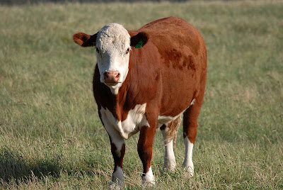
Here's a picture of a Hereford cow, shot with my Sigma 120-400 attached to one of my D80s. The image is not perfect or especially interesting but it's not bad for an exercise. Exposure is a fraction dark but there's no discernable camera movement or focus problems. I like the basic composition. But the whole thing could look a lot better than it already does. Let's post process it.

Let's start with contrast and exposure

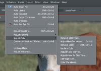
Okay, we open it in Elements and click on "Enhance". We are confronted with a drop down menu containing a series of options in three sections. The first section shows a sequence of 6 "auto" commands. I don't just reject these facilities out of hand. I have experiemented with them to see how well they work. I have to admit that some of them actually work quite well .... SOMETIMES. Unfortunately one is never quite sure when they are going to give good results or not. A good third to half of the time they overdo things or else get things plain wrong. You then have to go back to square one and start again. You have wasted time and the black box nature of "auto" commands has ensured that the user has advanced his/her image processing skills not at all.

I won't bore you with experiments right now, but when you start using Elements yourself please DO experiment and form your own opinion. For now, let's just let my experiences (okay, maybe my prejudices as well) hold sway.

In the next section of Enhance options, assuming we are not going to use the surprisingly excellent "Convert to Black and White" and assuming that we have no interest fooling with the not especially smart "Smart Fix" command, we are left with "Adjust Lighting" and "Adjust Colour". Whoopeee! Down to business at last.

In Elements parlance, what we are needing to do is adjust lighting and so we click on that option. We are greeted with three sub options: "Shadows/Highlights", "Brightness/Contrast" and "Levels". Shadows/Highlights has a specific use to solve particular problems and I'll discuss it another time. Brightness/Contrast is a simple command for adjusting an image's exposure but it has major limitations. I urge you to make the powerful Levels facility your exposure adjustment implement of choice.

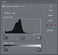
When you click on Levels a new window comes up as illustrated below.

The options are many but everything that you do is instantly monitored by the histogram in the centre as a double check against the actual appearance of the image. The default histogram is a compilation of all three colour channels i.e. red, green and blue although you can examine each channel separately if you wish. Let's leave the composite histogram as it is.

You see three sliders under the histogram. The white one adjusts highlights, the black one unsurprisingly adjusts shadows while the grey one adjusts the mid-tones. As a general rule to begin with, the highlight slider should be moved progressively to the left, such that it reaches the uppermost extreme of the histogram without clipping (i.e. blowing) highlights. The shadow slider should then be moved progressively to the right until it reaches the histogram without losing shadow detail. Hopefully the mid-tone slider can be left in peace.

Of course the Levels facility is cleverer than that. As you move the highlights and shadows sliders you can view the appearance of clipping in great detail by pressing the "Alt" key at the same time. The picture turns totally black and as clipping in each of the channels commences, sections of the image are revealed in red, green or blue. When all three channels clip together, the sections turn white. You can clearly see clipping occur from its very origins. Releasing the Alt key at any time allows you to see the extent to which actual channel clipping effects the appearance of the image. Brilliant!

Another way to adjust the contrast and exposure is to use the "eyedroppers". Click on the highlight eyedropper and click on any part of the image which SHOULD be completely white. In this case, click on the area immediately to the right of the cow's nostrils. Voila. All the other tones fall into place, simultaneously doing a great deal to sort white balance. Take the shadow eyedropper and click on something which should be black such as the cow's eye. Once again darker portions of the image should adjust themselves. How easy! If you feel that the whites are too white or the blacks too dark, go to the "Output Levels" sliders and fine tune the results by a few points. If shadow areas do not reveal enough detail, nudge the mid-tones slider a little to the left. If the image seems a little harsh or overbright, nudge the mid-tones slider a fraction to the right.

The final overall result should be as close to a perfect exposure and contrast result as can be made - and you've been in total manual control the whole while.

In summary then - if you want to fine tune an image's exposure and contrast, go immediately to Enhance - Levels. As far I can see, it is the only way to fly.

See my work at: www.pbase.com/davidhobbs

Tuesday, December 9, 2008

Setting up Elements

I can't possibly hope to teach the complete use of Elements in a series of blog articles. Rather, I want to discuss an "approach" to its use - to demonstrate the extent to which a careful selection of Elements features (at an expenditure of $AUD199) can go a long way toward impersonating the venerable Photoshop (at an expenditure of $AUD1099).

Let's confine ourselves to the "EDIT" strand of Elements. While the "CREATE" and "SHARE" strands are very functional I have my own approaches to such things in which programs like Elements don't often play a part. That's just me and I am far too old and ugly to change now.

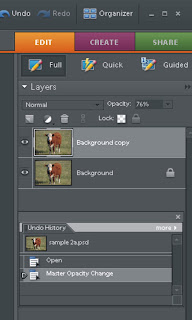
Anyway, the Elements version 6 interface screen can be customised to some extent and I would strongly recommend you doing so. I like a simple set up with as much image display space as possible. For this reason, I put away the "Project Bin" at the bottom of the screen but I like to keep the "Palette Bin" on the right. In the "Full" Palette Bin I keep only two windows open on a default basis. They are "Layers" and "Undo History". I find that I use those more than anything else. In Photoshop I also like the "Actions" window but (regretably) the lack of Actions capability is possibly Elements' biggest single shortcoming.

Ensure that at the top of the Palette Bin you have selected the "Full" (as opposed to "Quick" or "Guided") options. If you click on "Window" at the top of the screen a choice of additional facilities will be made available to you. "Navigator" has zoom and search abilities which LOOK as if they'll be useful. In reality I find them slower and less precise than alternative controls. "Histograms" are sometimes very useful but there are better ways to access these visual aids than through a permanent window taking up so much space. "Favourites" and "Content" are useful along with "Effects" and "Colour Swatches" if you are using Elements as a graphics design aid, but such is not our purpose here.

Some of the less useful windows are defaults when you first open Elements. To get rid of them, pull them out of the Palette Bin, click on the little white "more" menu, uncheck the "Place in Palette Bin when Closed" option at the top and click on the close window "X" in the extreme top right of the window. Go up to the Window menu at the top of the screen, choose Undo History and Layers, place them in the Palette Bin, and check the "Place in Palette Bin when Closed" option for each. Also ensure that the useful and tidy "Tools" palette is checked and resident down the extreme left of screen.

There - we have set up our Elements Edit screen and are ready to explore its tools.

See my work at: www.pbase.com/davidhobbs

Sunday, December 7, 2008

Getting into Elements


There is now an amazing number of software packages devoted to post processing of images. Some of these are genuinely excellent. A good many are pitched at people seeking "dumb down appeal" at the expense of actual performance. Such programs are festooned with features commencing with "auto-" or "smart-". I always get a little wary when confronted by commands which serve to take fine adjustment out of my hands.

This "computer knows best" approach is often the very reason that post processing of a given image was made necessary in the first place. Crude adjustments made by "auto" or "smart" fixated cameras at the instant of capture have very often gotten our pictures into trouble in the first place. Surely more of the same may just make the problems worse. If one is going to post process images, let's give control back to the photographer. Accordingly a lot of "easy", "quick", "auto" and "smart" style software packages are actually less than suitable for our purpose.

At its CS4 evolutionary state, Adobe Photoshop represents the last word in power, flexibility and precision when optimising images. It allows users to retain meticulous control of what they are doing while at the same time affording them powerful means for creating and fine tuning macro commands to take away the drudgery. It facilitates the "plugging in" of external programs to replace or augment inbuilt functions. Dozens of monthly magazines devoted to Photoshop adorn newsagency racks while many thousands of websites offer articles, courses, plug-ins, tutorials and advice on the subject.

If you have decided to post process images, using Photoshop attaches you to a world wide community of photographers all trying to do the same thing with the same tools. While any individual like you or I will never hope to master every intricate Photoshop skill by ourselves, the world-wide Photoshop user base collectively knows every last nook and cranny of its astounding capabilities. Choosing Photoshop over a less prominent package is a very good way to start your digital darkroom education.

The pity is that the full version of Photoshop is very expensive. Even upgrading to the latest version from earlier ones isn't especially cheap - particularly when you are doing it every 18 months or so.

For this reason I frequently recommend Adobe Photoshop Elements. Years ago they used to call the cut down version of Photoshop, "Photoshop LE" (Light Edition). The interface looked exactly like the full version and it wasn't always easy to work out what was really missing from the senior package. These days the situation has changed, "Elements" is still a cut down "Photoshop" but the interface is now quite different and a whole host of populist features have been tacked on - lots of "auto" this and "smart" that along with cosy "sharing", "creating" and file management facilities.

If you know where to look however, you can still dig up and utilise a kurnell of late-model Photoshop routines and facilities which allows Elements to substitute for the real thing quite nicely. In the blogs to come I am going to share with you how I have learned to strip Elements of its tinsell window dressing and utilise it as a serious substitute for the mother program. At the end of the day, if you get your skills moving on the "Photoshop" part of "Photoshop Elements" you will have a great headstart toward learning the full program later.

Check out my work at: www.pbase.com/davidhobbs

Thursday, December 4, 2008

Still looking for the truth


Does an important subject deserve one's best efforts in seeking a good image or will bravado, convenience and incompetence suffice? After all, an image like this one only has to last fifty years or so.

A lot of macho shooters, grew up taking film to the local camera shop or chemist. They'd get back their prints and were usually delighted with what they received. Images seemed consistently well exposed with good contrast. One can jump to any one (or a combination) of three possible conclusions.

  1. Modern exposure meters are basically infallible and will virtually always produce terrific results. Post processing is unnecessary.
  2. The shooter (probably of the macho variety) must obviously be an expert photographer and all of those wishing to improve their efforts would do well to listen to whatever advice he may choose to offer. He says post processing is unnecessary.
  3. The person(s) deciding that their results are so brilliant, wouldn't know a good image if they stumbled over it in the half light and performed severe injury to a shin.

To all of this, allow me to make the following responses:

  1. After all these years and as sophisticated as the hardware/firmware camera implementations now are, exposure meter systems are FAR from infallible. They are constantly tricked by prevailing conditions into providing less than optimum results. Overexpose by a tiny fraction and you may easily blow highlights. Underexpose by a little and all those masses of shadow lose their detail. People who believe that "straight out of camera results" rarely need processing have never been in a commercial lab watching operators make constant brightness/contrast adjustments to images moving through to be printed
  2. No one is expert enough to get perfect "straight out of the camera" results every time. It just doesn't happen - even images that look fine on the rear LCD preview screens can turn out to be unsatisfactory when examined under ideal conditions. Few casual shooters will take the time, during shoots, to meticulously examine preview screens for cropped histograms, poor focus, inaccurate colour balance and camera movement problems. In most cases, if the subject is important and you wish to honour it with a genuinely good image, post processing is essential

  3. It has taken me most of my lifetime to be able to assess the technical and artisitic merit of photographic images and I don't always get it right NOW. I DO know that there are few images displayed for me by well meaning macho shooters that could be described as something I'd have been proud of. Most casual photographers delude themselves into ignoring most of the constituent elements of what constitutes a good (as opposed to a serviceable) picture.

Let's examine a theoretical but all too common style of image (NOT the one above).

Yes it IS a lovely picture of the new baby. You can see who it is, she is smiling, the bright yellow shawl does indeed look bright yellow and the top of the subject's head has indeed NOT been chopped off. For most people (even toffee nosed types like me) the content of the image may make it a wonderful keepsake for the whole of their lives. No argument. But don't start telling me it necessarily does its beloved subject justice or that post processing might not have assisted it to BECOME a genuinely good image.

Why couldn't the image have been cropped so that the 40% of the image display area, presently occupied by the cot, be removed? Why couldn't the image be sharpened a little to help compensate for the inaccurate focus and/or slight camera movement blur? Why couldn't the exposure be adjusted so that the left side of the child's face is no longer lost in almost featureless shadow? Why couldn't the white balance be adjusted so that child's face, (lit by tungsten light) be less orange? Why couldn't the transient spec of anonymous vomit (presently adorning the baby's chin) be removed?

If a subject has value, surely it is a dishonour to that subject if every effort is not made to reproduce its image as competently as possible. To anyone with this level of sensitivity, it requires thoughtful camera work, some actual knowledge of imaging ... oh yes .... and post processing.

My work can be seen at: www.pbase.com/davidhobbs

Monday, December 1, 2008

The truth is out there ... somewhere


Agent Scully - could this be the truth at last? Go on - play the theme music. Duddlee Da Da Da .... Dee Da Doo Da ....

Among the macho amateur photographer fraternity is an endearing belief that what comes directly out of the camera is really the truth. What happens after that, presumably carried out by fast talking people with slicked back hair, white shoes, sunglasses, loud jewellery and pink suits (with the aid of computers and Photoshop) is some kind of DISTORTION of the truth. "Let's expose these deceitful Photoshop confidence tricksters who represent their doubtful alchemy as the REAL truth. Harrumph!"

In the words of the immortal Thadeus D. Hoppenheimer ... "Give me a break".

If we are going to expose something, let's expose, once and for all, this notion that what comes directly out of a digital camera is really the pure unsullied truth and that post processing is the instrument of its pollution.

Let's leave aside (for the present) the question of correct shutter speed and aperture. Let us assume that our macho shooter (hereafter known as MS) somehow manages to get the image exposure settings spot on every time in his search for the truth. Such a feat would be truly incredible ... BUT ... let's assume it anyway. We'll come back to the metering issue another time.

We'd better define what "the truth" means before moving on. In the absence of something more philosophically rigorous, let's say that MS's truth is "what he originally saw before deciding to take a picture". Okay, let's go with that.

MS takes a picture with his digital camera. It is the best exposure that can be expected. He examines it in his computer, prints it out on his dot matrix printer or else takes it to the lab at K-mart to get a print made. MS doesn't believe in "cheating" with Photoshop and so we know that he didn't shoot it as a RAW file (which requires post processing). Nor did he intentionally manipulate it in any way with computer software.

Is the image in the print, that he holds in his hand, the truth? Almost certainly not.

His girlfriend, the central subject of the picture was originally some distance away but was brought closer than MS's original natural view by his zoom lens. The image is not what he actually saw with his eyes. By MS's strict standards it must already be an untruth. MS's nice landscape was framed to omit the overflowing rubbish bin just to the left. Untruth. The landscape features a setting sun and the image shows bits of lens flare. Untruth. The trees to the right are actually much darker than MS saw because the bright sun caused the camera's exposure metre to render them in silhouette. Untruth. Good photographer that MS is, he brightened his girl friend's face with fill in flash so that it wouldn't be rendered as a dark outline by the sunset. The result could not possibly have been seen before the decision to shoot was made. By definition it is an untruth.

Once he takes the purist route, MS is immediately in trouble. As soon as a decision to take a picture is made, MS's "untruths" are inevitable. Some arise from the fact that large amounts of the scene he originally saw are inevitably cropped out - either on purpose or because not everything in his field of vision can possibly remain in shot. Some arise because of the inherent limitations of cameras and lenses. When shooting directly into the sun, lens flare is virtually inevitable. Likewise, the dynamic range of a digital sensor is severely limited. Detail will inevitably be lost at either the shadow or highlight end (or both), such that the trees which originally showed green detail are now black outlines. If he was using a fast lens and/or was especially clever, background may be pleasingly reproduced out of focus, bringing the girlfriend's face into sharp relief. It may make a great picture but it "wasn't what MS originally saw". UNTRUTH.

But MS can go forward content in the knowledge that he didn't ... heaven forbid ... "photoshop" it. Of course if MS HAD photoshopped it, he might have been able to remove that untruthful lens flare, restore those untruthful tree silhouettes and retrieve truthful detail in his girlfriend's hair highlights. But let's not worry MS with inconvenient details like that.

The irony of it all is that MS's allegedly unsullied picture has ALREADY been well and truly "photoshopped" in a manner of speaking. Because he didn't shoot RAW, his camera's JPEG firmware has taken it upon itself to process the image in a number of ways.

  • The camera has almost certainly artificially sharpened the image. All digital sensors have anti-aliasing filters which blur images slightly to reduce the appearance of pixellation. In producing displayable imagefile formats, pictures are routinely sharpened to some extent.
  • The camera has probably enhanced the image colour. Industry research reveals that most people "remember" more colour in a scene than is strictly captured by a digital camera. To deliver a popular colour effect, images are usually auto-processed in-camera to saturate them a little.
  • Sometimes at high ISO settings, camera firmware automatically DEsaturates colour in order to minimise noise.
  • Depending upon the settings, the firmware will deliver a relatively wide range of contrast values.
  • However good the auto-exposure may be, white balance, as determined by camera firmware, is often wildly inaccurate.

The proposition that an image direct from a digital camera is always the inviolate truth is highly questionable at best. Digital cameras and the very notion of image capture are imperfect in themselves. Usually the image "straight out of the camera", has already been processed - often inaccurately. It may be time for MS and all of his ilk to cast aside their comfy delusions.

Whatever the camera does to images can only be controlled imperfectly in the heat of the moment at the actual time of exposure. Camera settings and their effects are crude at best. The whole point of post processing is that image parameters can be adjusted at one's leisure using genuinely fine gradations to arrive at the best approximation of the truth possible.

Is there more to say on this subject? You bet! I am only getting warmed up.

See my work at: www.pbase.com/davidhobbs

Saturday, November 29, 2008

Digital darkroom


Photoshop was in version 3 where I first encountered it, back in 1995, although I had been using an early version of Corel Photo Paint before that.

By the early 1990s, unless one was a hobbyist, scientist, freelance photo-journalist, print media service bureau, very high end commercial shooter or low volume/big ticket fine arts photographer, having a private wet processing lab was on the way out. Running a traditional analogue darkroom had become altogether too cost inefficient, too slow and too impractical for anyone not prepared to work in it full time and gear up for genuine volume. Commercial lab businesses quickly became the way to go for most suburban wedding, school, portrait, ad stock and community event shooters.

This was especially true for advertising outfits which did a variety of things in addition to straight photography. I had been taught essential darkroom skills when I was young but by the time I had a NEED to actually process film, the very idea had passed its use-by-date. Besides, transparencies were favoured for quality print publishing and they had to be processed for us at Kodak or Pacific Labs. Then again, clients often brought in their own trannies, negatives or prints to scan.

By the mid 1990s, for an increasing number of camera jockeys, the Photoshop "digital darkroom" had become the ONLY practical darkroom - many years before modern digital cameras ever came along. If one wanted to optimise an image's exposure, remove or replace a background, get rid of dust & scratches, air brush a model's cheek, enhance contrast or saturate colour, chances were that a traditional film photographer was using a digital darkroom like Photoshop, for the purpose.

Adobe Photoshop is and has always been an essential part of the serious photography/print media process. The work of legendary photographers like Ansel Adams and Frank Hurley were very much about wet darkroom post processing. There is no doubt in my mind that had film scanners and Photoshop been around in their day, both men would have been using them on a routine basis.

It is a little weird, therefore, to encounter the post processing counter culture which has appeared among amateurs in the last few years. You've all seen and heard it. Somehow, people who use Photoshop are cheats, defrauders and generally weak photographers who, (unlike presumably strong MACHO photographers) need to be propped up by "artificial" means. I get a little sick and tired of having some of my best work criticised by macho amateurs along the lines of "..... it's all right I suppose but you Photoshopped it .... you DID didn't you? .... you can't fool me".

Sigh! Spare us these people - PLEASE!

In the next blog I will address myself directly to those for whom "Photoshopped pictures" somehow don't really count.

See my work at: www.pbase.com/davidhobbs

Wednesday, November 26, 2008

Senseless megapixels part 2


For anyone interested in cameras and (to a lesser extent) photography, there is no website which offers the same amount of information, the same volume of forum traffic and the same meticulous reviews of equipment as http://www.dpreview.com/

I have followed it for many years and can recommend it highly. Recently, dpreview.com reviewed the very popular and highly acclaimed Canon G10 which proudly boasts a 14.7 million pixel sensor. They compared the results with those from the older, 10 megapixel Canon 1000D with the ISO sensitivity set to 1600. There were many pictures captured by both cameras for the purpose and this is ONE of them, examined close up at 1:1 (1 image pixel to 1 display pixel).

Now we all know that more pixels means bigger, better clearer pictures ....... right? When we look at the two images at the head of the article it is easy to conclude that the upper one must have been taken with the new 14.7 megapixel G10 while the lower one must have been taken with the older 10 megapixel 1000D. Right? ............ WRONG! In fact the lower picture was shot by the G10.

In every way, the upper image is superior and there is just no way to get around that simple fact. 10 megapixels absolutely beat the crap out of 14.7 megapixels. It is important to emphasise that every precaution was taken to make the comparison as fair as possible. It is also important to emphasise that this one illustration does not tell the whole story and interested folk should go to http://www.dpreview.com/reviews/canong10/ where the entire article makes interesting reading.

Say what we may, however, the small illustration above IS accurate and for all those who agree with me about the senseless marketing-department-driven megapixel race, the result is not in the least surprising. The central point I am trying to make is that the resolution specifications of a camera are but one small part of the story about how good a particular camera may be for your purpose.

All right then .... WHY does the image captured by the higher resolution camera look so bad?

To begin with, the most important specification for image sensors is NOT just how much resolution is available to them but how physically large they are as well. The sensor in the Canon 1000D (being a DSLR) enjoys a APS-C sensor approximately 5 times the size of the tiny G10 sensor. This means there are many many more "photo-sites" to the square millimetre in the G10's sensor than is the case with the 1000D's sensor. In other words, the "pixel density" of the 1000D sensor is very much lower than the G10's. Beyond a certain point, the lower the pixel density of a sensor, the less noise will be evident in one of its images and the better that detail will be retained in an image as the sensitivity increases. Put simply, "low pixel density, clear picture - high pixel density, muddy picture".

Don't get me wrong. At ISO 80, the G10 will produce an image which seems every bit as good as the 1000D. Unfortunately, as you strive to capture more and more ambitious images under less than optimal lighting conditions or as you try to freeze faster moving objects or as you attempt to increase depth of field, increased sensitivity is desirable, revealing the limitations of pixel dense sensors.

To make matters even worse, pixel dense sensors place greater resolution demands on lenses. The same lens will appear to resolve images less clearly with more densely populated sensors than it would with less densely populated ones.

These simple facts seem to be ignored by the camera manufacturers who appear to be betting on newcomer ignorance to carry the day. It is easier for purchasers to digest steadily higher numbers of pixels than to appreciate the issue of optimum pixel density.

Thus the senseless increase in megapixel specs carries on unchecked while (in all but the best possible lighting conditions) the pictures themselves get noisier and fuzzier. Ridiculous isn't it?

See my work at www.pbase.com/davidhobbs

Monday, November 24, 2008

Senseless megapixels


The image above is a sunset I took recently looking west across the railway tracks at Blackheath. As displayed here, the image measures 408x274 pixels (111,792 pixels in all).

Ken Rockwell is a blogger who is well worth a read. He got to be well known by making controversial statements and expressing over-the-top opinions. Why not? Doing the latter has made him very successful. Check out this article entitled "Your Camera Doesn't Matter" at http://www.kenrockwell.com/tech/notcamera.htm

One of the things that makes Ken annoying for many people is that very often his seemingly outrageous views are spot on. "Your Camera Doesn't Matter" is a case in point. For potentially serious photographers, the message is clear. Beyond a certain easily reached point, for all the things that REALLY matter in a great image, the alleged differences between cameras and lenses don't matter.

I'll go further. Despite what the pixel peepers will tell you, for most display purposes, under optimum conditions, there will be no real noticeable difference in image quality, no matter what modern camera you buy. If you are obsessed with finding out the truth about which of those shiny new cameras in the Harvey Norman display case is actually the BEST, forget it. There IS no BEST camera. Almost ANY new digital camera will be capable of providing terrific image quality .... end of story.

This is not to say that all cameras are created equal. Each device is optimized for use under particular conditions and for specific purposes. But the REAL quality differences between images invariably come about because of non equipment factors such as lighting, composition and a photographer's technical skill.

A lot of new photographers (and even some photographers who should know better) have been led to believe in the universal digital camera "goodness" factor. Manufacturers would love you to believe that "the more megapixels, the better quality the image". That keeps everything nice and simple does it not? If one succeeds in convincing new camera purchasers that "more megapixel good - less megapixel bad" it then becomes simple to massively increase sales of one's product by just increasing megapixels. What could be easier? Yet another triumph for the marketing department.

Here are a few facts to help explode the megapixel myth. Go to this address: http://www.pbase.com/yp8/image/22187488

This is one of the beautiful images to be found on Yves Pinsonneault's wonderful galleries. It may prove useful to explore his website and let yourself become inspired. In any event the image I asked you to find looks good on your computer screen does it not? That image, as displayed measures 800x554 pixels and could theoretically have been shot by a digital camera with a 443,200 pixel sensor i.e. a little less than HALF a megapixel. When you consider that most images are now viewed on computer screens, it seems almost ridiculous to be obsessing over 15 megapixel sensors (30 times the resolution), doesn't it?

What on earth, therefore, is the benefit of all those megapixels so often gushed over by the salesmen at the counter? The answer, as always, is .... it depends. One thing in particular needs to be emphasized. Increasing the number of pixels in an image (beyond a point reached several years ago) has little or nothing to do with improving image quality. It IS for the purpose of increasing an image's potential display size.

In the interests of saving time here are some sweeping (but accurate statements) about resolution.

If all you want to produce are lovely images on a computer screen and sharp 8x6 inch prints, a 3 (that's right! 3!) megapixel camera is as much as you will ever need. You will not see any increase in image quality for those display purposes on the basis of higher resolution alone.

If you want to produce A4 or (say) 12x8 inch prints, 6 megapixels is more than enough. NO visible increase in image quality for those display purposes can be obtained using higher resolution sensors. In fact I have often produced beautiful 18x12 inch prints from 6 megapixel images which were effectively indistinguishable from the same subject shot with a 10 megapixel camera. For computer display, email sharing and such you will need to actually REDUCE the size of 6 megapixel images.

If you start with a solid noise free image, I find that you can interpolate an image by up to 50% without any loss of picture quality that yours truly can detect. Thus a 6 megapixel image is really a 9 megapixel image and an 8 megapixel image is really a 12 megapixel image in any event.

Here is an excellent article by Thom Hogan about the relationship between megapixels and image size: http://www.bythom.com/printsizes.htm

The point I am making is that for the vast majority of us, 6-10 megapixels is MORE than enough to produce breathtaking images for most display applications we are likely to encounter. Certainly the 15-24 megapixels offered by the latest models is (for most of us) decidedly overkill. The pity is that as we rush headlong into ever higher resolutions, picture quality starts to DETERIORATE rather than improve. I'll show you why in the next article.

See my work at: www.pbase.com/davidhobbs

Saturday, November 22, 2008

The great Instamatic days


The very first camera I ever owned - full stop - was a Kodak Instamatic 200. It was one of nearly 60 million such cameras sold world-wide by the Kodak camera company between about 1963 and 1970. It was perhaps the last great hurrah for American camera manufacture and marketing before the Japanese industry effectively took over the world.

The first Instamatic to make an impact in Australia was the model 100 (pictured above) which was actually manufactured here. Philosphically it was a direct descendent of the Box Brownie series which had brought photography to the masses at the turn of the twentieth century. It was a genuine inspiration and consisted of a pretty little box which opened at the back to allow a brilliantly conceived film "cartridge" to be dropped in. It was incredibly simple to operate, offered a wide angle lens which had so much depth of field that focussing was unnecessary, a simple shutter release and a film advance lever. Provided that the conditions were bright and assuming that your shaky hands could live with a 1/90 sec fixed shutter speed, the average person could get an acceptable colour picture every time. Thus uncounted millions of sunny day family "line ups" at back yard picnics were committed to film.

For those who might actually take a picture in other than sunny circumstances or who might want to get a little closer to their subjects, my Instamatic 200 was a surprisingly important step up. It was manufactured exclusively in England and was possibly the best thought out non-exposure metered super cheap camera ever made. It provided four basic aperture settings which covered most circumstances: bright sunshine, low sun (early morning & late afternoon), light overcast and dark. It had four broad focus zones from close up to infinity and a slightly longer (and more flexible) lens.

Looking at some of my earliest slides, I can see that the old Instamatic did a creditable job, but when I used to compare them with the slides of a very dear friend of mine (who owned a proper 35mm camera with a really good lens) I quickly became dissatisfied. The rest is largely a sad history of frustration, expense and just plain foolishness during which I thrashed around looking for the perfect camera and lenses which would make of me the perfect photographer.

Some years ago it dawned upon me that I would NEVER become the "perfect" photographer. If I was ever to make money in photography I would need to learn to become a "good enough" photographer. Moreover, being good enough (beyond a certain point) had little to do with equipment, perfect or otherwise.

See my work at: www.pbase.com/davidhobbs

Friday, November 21, 2008

Nostalgia time


Well I have talked about most of the cameras I ever owned and here are two more for now. I shot this image just yesterday as part of my pbase "Photo a Day" activity. The lighting was the issue that occupied me the most but in the end, the subject itself looked so fetching that I simply HAD to include the picture here.

What do you think? Isn't it beautiful? This old OM10 was part of the famous Olympus "OM" series which began with the ground breaking OM1. The little silicon chip icon on the front of the body was to indicate that this camera was among the first to incorporate "computer technology" into a metering system.

Mind you, I purchased this camera for personal use back in 1980, just when the old Apple 2 computer reigned supreme. It is difficult to imagine that either the OM10's circuitry or its firmware was able to do anything especially clever. Nonetheless I took countless nice images with this device - mostly running Kodachrome 64 or various of the Ektachromes for transparencies.

I especially love the glow that cameras of the period get when you light them half decently. Most especially those wonderful old lens coatings used to reveal so many colours when you lit them like this. When you pick up an old film SLR it somehow has a solidity that even very expensive DSLRs lack. Sigh! I loved it back then when one breathlessly waited for the slides to come back from Kodak. For all the improvements which digital cameras allow us to achieve in our images, I still miss the magic of the little yellow boxes.

Some people are never satisfied - wouldn't you agree? This is especially true of silly old codgers with rose coloured glasses.

Of course the first half way decent 35mm camera I ever owned (from 1967) has a special place in my heart and of course I sold it (like an idiot) many many years ago. It was a classic rangefinder type - the Minolta Himatic 7s . This picture is from Matt Denton's terrific website, part of which is a kind of classic camera museum: http://mattdentonphoto.com/camera

The time of my life in which the Himatic 7s played a part was well before I ever made money from images but my experiences with that camera helped turn my soul toward photography like no other.

See my work at: www.pbase.com/davidhobbs

Thursday, November 20, 2008

Semi retiring cameras


You know how it is - or perhaps you don't. You look longingly at the idle years ahead in retirement only to become a little frightened as you actually creep up on them. Perhaps I should continue to work just a bit .. keep my hand in ... avoid feeling irrelevant ... head off boredom ... keep fit .. stay mentally active etc etc. I know!! I shall go and shoot pictures for realtors marketing properties on the web and in glossy magazines. In truth I had been doing this on and off for many years. This time it would be the main game.

It began as an occasional outing but gets to be pretty full on at times. My retirement is really only SEMI retirement at best. Nonetheless I have presently struck a pleasant balance. As for the future? We'll just have to see, I suppose.


At any rate I needed tools. My D100's were sold while they still performed well and continued to be worth something, my D40 couldn't be expected to work for a living on a permanent basis. The choice seemed to be between the incoming D300 (a handsome beast indeed) or the outgoing (but handsomely priced) D80.

Back when I was using Minolta SRT101s, you could expect a well built body to last 10 or 20 years. Film was the same no matter what you loaded it into. The gear was unlikely to be made obsolete from genuine technical innovation affecting the end product.

Digital is different. After 3 or 4 years of use, one can expect a DSLR to pale before the onslaught of the latest models, offering more pixels, less noise, better metering, larger screens, clearer viewfinders, more effective sensor cleaning, faster operation and sexier features. Some of these things can represent savings in time, greater efficiencies in operation and just plain better product. Moreover the risk of circuit failure grows larger with time along with shutter problems and the need for pixel re-mapping - all of which represent expensive servicing. The cost of modern gear must be written off against the earnings from no more than 3 or 4 years and when you're in a lower tax bracket (part time income only), deductions for depreciation, lease payments or service costs are correspondingly less helpful.

At the same time it was undeniable that the new tools would not be asked to work flat out every day, they would not need to offer super rapid operation, would not require the last word in low light performance and (given that they would mostly operate from tripods) should be less likely to suffer falls.

In the end I got two Nikon D80 bodies for less than the cost of one D300 body and haven't looked back. They are very suitable work horses, do a more than adequate job in every respect, offer back up should bad luck befall me and will each owe me a lot less money when they themselves come to the end of their working lives.

See some of my real estate work at: www.pbase.com/davidhobbs/real_estate

Wednesday, November 19, 2008

You little beauty


Walking around with a relatively large and heavy device like the Nikon D100 gets a little wearing after an hour or two. Hiking long distances into nature parks, covering community events, attending car shows and such can be an exercise in severe pain before one is through - particularly when one is getting on a bit.

About twelve months or so ago, reducing work commitments to part time, I decided to get myself a capable camera for personal use which could be lived with for hours at a time without the need for paramedics, high end pain medication and/or hospital emergency rooms by day's end. So I bought a Nikon D40 with basic 18-55mm zoom lens.

Now I know that there are a lot of experts posting to dpreview.com (with positively months of experience) who will swear that it is well nigh impossible to obtain high quality images with anything less than a $3000 kit. I am here to bust that myth. I have been through the mill a few times, have run a few thousand rolls of film over 40 years or so and have recently learned to tell a good image from a poor one. I am far from the best photographer in the world but I HAVE come up with a few nice images in my time.

I have to tell you that the D40 is very much my camera of choice. In fact I will go so far as to say that the D40 is the nicest compromise between performance and convenience I have EVER used.

It is light enough and small enough to carry around all day and to hide under parkas when it rains. It is so uncomplicated and undemanding that one can learn to get the most out of it very quickly. It contains all the features I need (i.e. only several times the features of any film SLR). The kit lens is astonishingly good, producing excellent low distortion results at almost any aperture and focal length. It is extremely good to handle, such that even at the end of a long day it is easy to obtain camera shake-free images. It is quiet and fast. It can deliver surprisingly clean images at ISO 1600 from its low pixel density sensor.

In short, it releases a photographer from all of the appalling encumbrances which most other cameras thrust upon one - so much so that he/she can simply get on with the task of capturing images. In the words of the old Minolta ad for its legendary SRT 101. "It never says no to a creative challenge." I am simply delighted with it.

Of course the D40 is not designed for use in professional circumstances. If I was to work it every day (hundreds of images at a time) it might ultimately fail me. On the other hand, it is now so cheap that I could buy FIVE D40 kits for the same cost as ONE D300 with 18-200 lens. If the camera ever lets me down I will go buy another one (or whatever replaces it). Big deal.

See lots of D40 pictures in my "picture a day" gallery at: www.pbase.com/davidhobbs

Monday, November 17, 2008

DSLRs changed my world


Within 6 months of my buying the Canon S30, affordable digital SLRs began to emerge. I went out and bought a Nikon D100 mainly because my latest film camera was a Nikon F80 (that's N80 to you Americans), I had enjoyed good experiences with it and I already owned a few Nikkor lenses.

In those early days (2003), so called "affordable" DSLR bodies like the D100 still cost over $4000 Australian but I felt that the investment was worth it. Before the end of that year I had bought a second D100 as the amount of straight photography I was then doing had increased a lot and I needed a back-up.

The D100 has since suffered a lot of nit pick criticism for all the things that it wasn't. It must be remembered, however, that for a short while in the Australian market, it virtually stood alone as the viable tool for small-scale photographers wanting to take advantage of the wonderful business efficiencies that digital could provide. Many gripes were made in the light of later models by johnny-come-latelies looking at old spec sheets. The D100 was not replaced until the D200 came along a whole three years later. It becomes very much easier to produce better cameras when you have a long working career like the D100 to learn from and later technical innovation to take advantage of.

Neither of my D100s ever let me down, most operations were virtually instant, picture quality was everything I could have asked for and despite their hand-me-down F80 construction, they continued to labour on without complaint despite the hard life I put them through. I have since sold my D100s to amateur photographers who (at last report) remained very pleased with them.

One thing that so many people choose to forget is how much more technically advanced the first DSLRs were, compared to even the very best film SLRs. In reality, film SLRs in 2003 were still only highly refined versions of innovative 1960's models. DSLRs were a world apart, providing capabilities we could only have dreamed about previously. While it was possible to whine about the ultimate resolution shortcomings of 6 megapixel digital images compared with film, the fact was that the quality of what I was producing did indeed soar, my running costs did indeed plummet and the speed at which I could get completed work into layouts and over to clients had left film spinning in the dust.

If cameras like the Canon S30 had served notice that film's days as the resident imaging technology were numbered, cameras like the Nikon D100 arrived with the sherrif brandishing an eviction order.

See my work at: www.pbase.com/davidhobbs